This year we celebrate 15 years of business – we’re in the prime of our adolescence (although I do wonder if ‘business years’ are more akin to ‘dog years’…). So along with the teenage eye rolling, always being right and being waaay cooler than everyone else, we also decided to see in the chapter with a new logo and branding.
We didn’t make this decision lightly – a logo is an important aspect of a company’s identity and we all know the horror case studies like Tropicana and Gap. But even the biggest brands refresh their logos and branding over time – the change might be as subtle as the width of a font or the shade of a colour, or it may be a dramatic overhaul.
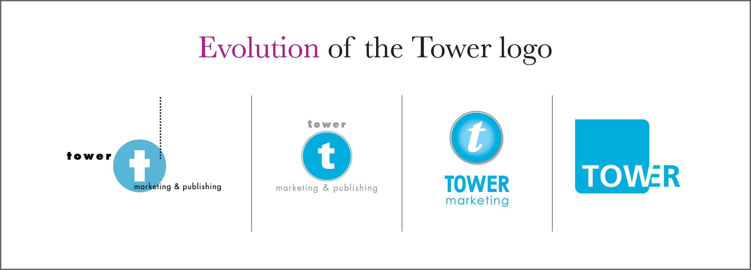
We’ve made little modifications to the Tower logo over the past 15 years, but with the exciting changes happening within our company at the moment we felt we needed a more extreme makeover. Companies change, tastes change, and design changes – we wanted to keep our brand looking fresh and professional.
So what does our teenage wardrobe look like? One big difference – we dropped the ‘Marketing’. In 2007, Apple CEO Steve Jobs announced that Apple was dropping the word ‘Computer’ from its name to become ‘Apple Inc.’ “The Mac, iPod, Apple TV and iPhone. Only one of those is a computer. So we’re changing the name,” said Jobs.
Tower’s business has changed over time. We are a creative, strategic communications agency. Having the word ‘marketing’ in our logo constrained us, and was no longer relevant, in terms of our current products and services.
Over 15 years of business in Cayman we have built equity in our brand and logo design. It was therefore important for us to incorporate elements of our old identity into the new identity to keep it still looking and feeling like ‘Tower’ – so we kept the same colour blue for our logo and incorporated the grey that was previously around the circle into our new corporate branding. What else is new?
– We dropped the ‘T’
– More modern font: the new san-serif font is Frutiger Bold. Its heavy weight and uniformity contributes to good readability.
– Colours: our branding is clean and neutral with bright pops of colour. We’ve kept the Tower Blue, and have added a Charcoal grey to ground our brighter secondary colours. The grey is neutral and cool and works well with all colours.
– From circle to a round-corner square: the square is more contemporary – with its one sharp corner – and works nicely with social media too.
We’re thrilled with our new logo, business cards, website and the rest of the corporate swag. It’s the perfect new look to see us into the next 15 years!
